Problem
A subdivision of Lauren International, Lauren Innovations develops products that streamline processes and operations within an organization. First up was to develop their corporate identity. The name by itself didn’t really offer an obvious graphic direction, but the purpose of the company did. They offer products directed at a safer, healthier and more secure world. It is a resourceful company. The brand essence can be translated in one word – spirited. This is a trait that can be taken in a number of ways. But they saw it as a positive one that is representative of being flexible and progressive.
Solution
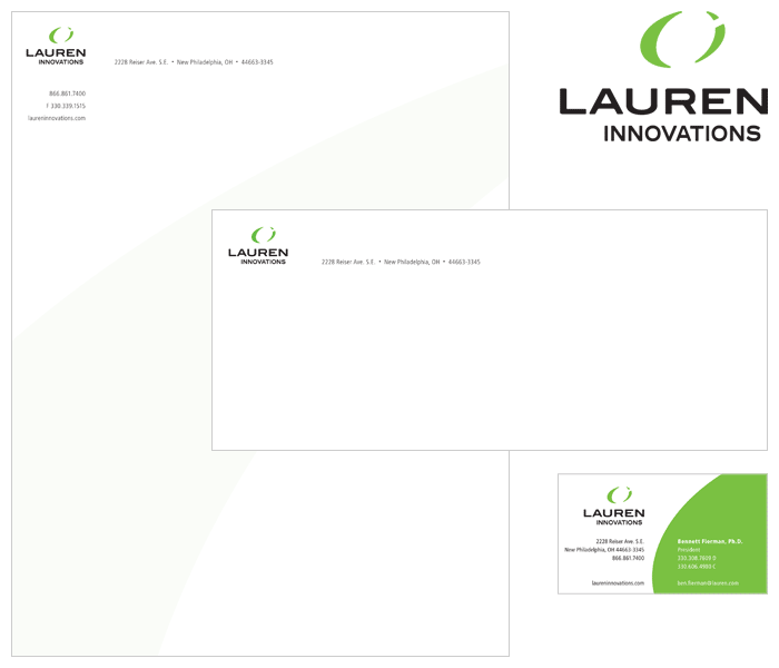
The final choice for the symbol used the letterforms “L” and “I” in a circular, global shape, creating movement, energy and a sense of forward thinking. The logotype uses clean sans serif typography. All the corners of the type and symbol are rounded to add a friendly yet confident feel. The identity says smart, agile and competitive.
Impression
The client was more than pleased to have a strong logo backing a bold company.
Responsibilities
Graphic Designer | Concept | Typography
